Cutting Edge
Branding
BACKGROUND
Cutting Edge is a residential framework provider serving the north of England and the Midlands. It supports with the procurement and delivery of mixed-tenure properties across social and affordable housing, affordable rent, affordable shared ownership, open market sale and older person shared ownership.
APPROACH
The Cutting Edge branding and website was originally created in the early 2000s, and as such was no longer suitable for its audience base. We held a brand workshop reviewing colour palettes, font, brand marques and messaging to create a brand that better reflected its culture and offering.
Industry
Branding & Marketing
Property
Property
Location
UK
Services
Brand messaging
Branding & Marketing
Social Media
Visual identity
Workshop facilitation
Branding & Marketing
Social Media
Visual identity
Workshop facilitation
RESULTS
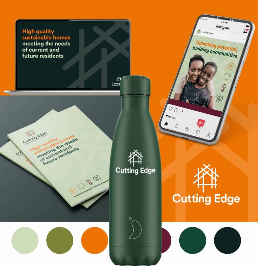
We developed the following areas of the Cutting Edge brand:
- A new strapline that helped to better underpin the Cutting Edge offering as the existing brand name did not produce an instant connection to a housing framework
- We created a visual brand identity that combined a softer pastel tone with brighter earthy tones to modernise the look and feel
- A graphic brand marque with strands representing each of the nine members within the framework in the shape of a house. This could be used in isolation for social media applications
- A softer serif lower case font for the brand name and body copy font
- A set of icons to reflect aspects of the offering and USPs
- Developed the brand to demonstrate application across a number of assets including a landing page, PowerPoint presentation template, social graphics, brochure and merchandise