PERMAGROUP
Background
PermaGroup (formerly known as PermaRoof) is a leading provider of innovative building products and has been a PR client since 2019. In the past few years it has been rapidly expanding as a business, adding new brands across the full spectrum of building products. As a result, its brand architecture was in need of a review. The PermaRoof brand name did not capture the full scope of its offering and was a confusing reference to customers who were not always looking for roofing solutions.
Step one - audit
We conducted a thorough audit of their existing PermaRoof branding and found a number of inconsistencies in terms of multiple fonts and colour variants. These were being used across its brands.
Industry
Building Products
Social Media
Location
Services
Social Media
Visual identity
Step two - the parent brand
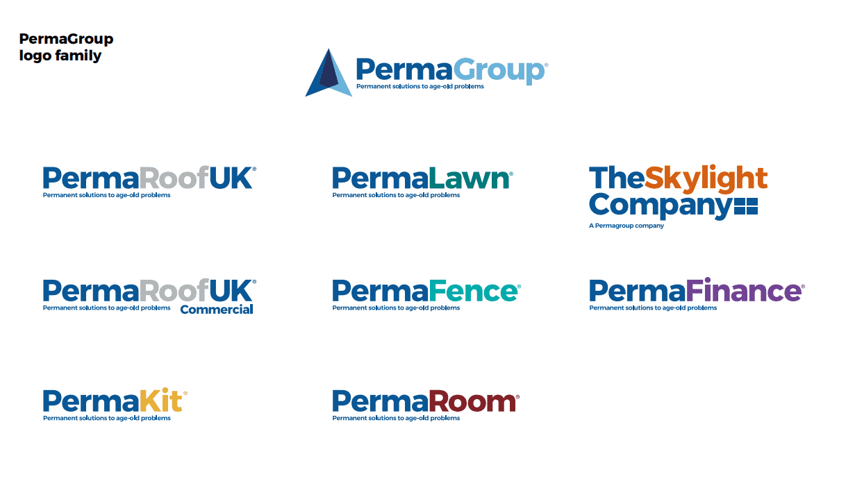
Firstly, we tackled the name and proposed the creation of PermaGroup. We felt this leveraged the existing brand equity with the use of ‘Perma’ as the prefix, but ‘group’ gave the brand the overarching level they needed.
We then established what the primary colours for the new parent brand were going to be and set about developing what the master identity could look like. We employed a geometric graphic marque in the shape of an arrow to reflect innovation and its upward trajectory of growth.
Step three - the brand family
We then explored how we could create a brand family and demonstrated to the client how global corporations such as Virgin, Tesco, FedEx and IBM utilise various techniques with brand marques, colour palettes and fonts to distinguish between sub-brands, while also creating a cohesive family.
We created examples that utilised a similar geometric graphic marque while reflecting the offering of the sub-brand. We also created concepts that used various earth toned colourways to infer that these products are built to withstand the outdoor elements. We recommended that the team adopt the latter approach so that the logo marque was only utilised for the master brand to give a more distinct hierarchy. We art worked the files ready for application and created brand guidelines to ensure ongoing consistency.
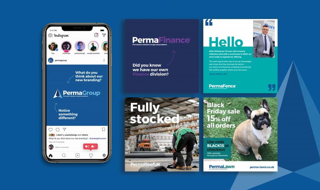
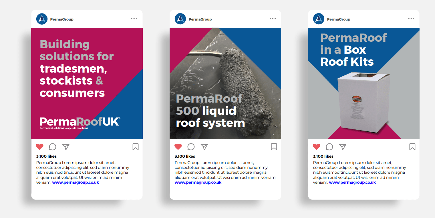
Step four - brand application
It was time to bring this new branding to life and demonstrate how it could be applied across various touchpoints such as social media and adverts. We also provided consultancy with how the new website should be structured in terms of the user journey to reflect this new architecture.
Since this project was completed we have also provided further support with differentiating the two sub-brands that sit underneath PermaRoof to create contrast on social media feeds.
If your brand is in need of a refresh or a new identity, we can support you across the entire process.